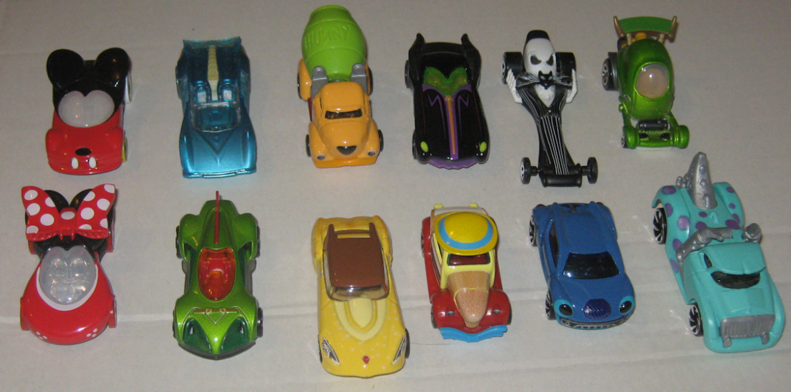
About 6 months ago we got this set of spectacularly painted RealRiders done up in the theme of several Disney movies. You can read all about ’em here; needless to say I was completely enamored by the quality and detail of the artwork. So when I stumbled across “Round 2” a few days ago amidst these Q1 doldrums, I was more than happy to snatch ’em up. Here’s what we’re working with:
- 1 / 5 – Pinocchio – ’66 Dodge A100
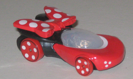
- 2 / 5 – Dumbo – Bread Box
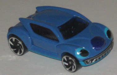
- 3 / 5 – Alice in Wonderland – Volkswagen Deluxe Station Wagon
- 4 / 5 – Sleeping Beauty – Super Van
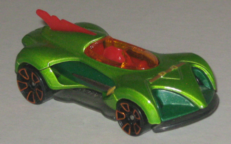
- 5 / 5 – Robin Hood – 3D-Livery

We’ve got a lot of familiar faces here – the Super Van, and A100, the Bread Box, and so on. Why does Hot Wheels keep choosing the same models, right down to the year? (One day I’m seriously going to go through what I have and take a count of each model…should be mildly interesting.) I assume it’s due to the amount of space available for the expansive portraits and scenes. Most of them contain a sizable, uninterrupted rectangle (or square) with ample room for anything from a long, panoramic shot of a landscape, a medium-distance scene of a few character in some sort of interaction, or a nice big closeup of one or two main characters.
Like the previous set, these things are miniature works of art, right down to the cards which are as colorful and detailed as the cars themselves. I actually kinda hate to open them, and if they weren’t a whopping ~$5.47 a piece I’d probably snag 2 of each. The cards are about 1.5 to 2 times as thick as your average back and almost the entire front surface is filled with a fantastical poster from the appropriate time period. You’ve got the dated fonts, a hokey tagline or two, and an absolute flood of color. I think that’s what hits home most with me about these guys: it’s the sheer range of colors in use. I guess “back in the day” these movie posters were treated a lot like paintings and thus there was a lot artistry in mixing and making colors – nothing as homogenized as today’s digital colors. (Obviously a computer display can replicate these colors, the idea is that perhaps a given artist’s “red” was not #FF0000 and this “old red” was used to make pink, which was then used in a purple, etc. …small irregularities in customization that build up over time and between different artists.)

First in line is Pinocchio it the Dodge A100. We’ve got some expected artwork of Pinocchio, Geppetto, and Jiminy Cricket on the sides which is nicely detailed. Even Jiminy, as small as he is, can be seen clearly. One side features (what I assume to be) the moment Geppetto brings the puppet to life, and a closeup of Jiminy can be see on the rear doors. What I like most about this particular vehicle is the blue-purple gradient that fills the ambient space. It creates a dreamy effect and it’s not a shade of blue I’m used to seeing often.
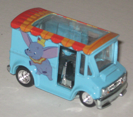
Next is the Bread Box featuring Dumbo; perhaps it’s appropriate that such an outdated vehicle features one of Disney’s oldest animated films. (It was their sixth theatrical animated film.) I never much “got” Dumbo but there’s no point in doubting its cultural longevity and what I assume to be its influence on later works. The entire vehicle is awash in a baby blue with the roof painted to look like the top of a circus tent. One side prominently features Dumbo while airborne; the other showcases a tender moment between our titular character and his mother. The back has some mouse who I’m 100% unfamiliar with… I appreciate what’s going on here but again, Dumbo just doesn’t resonate much with me. I kinda dig the idea of turning the Bread Box into a circus tent though. (And oh god help us – Dumbo is another animated film succumbing to Disney’s live-action curse. I’ll be interested to see how this performs, because it’s not like today’s little kids – or even their damn parents – have much familiarity with the character, let along the movie.)

Here we are at the midpoint with Alice in Wonderland artwork plastered all over the Volkswagen Deluxe Station Wagon. You can certainly interpret Alice in Wonderland (I’m just gonna call it “Wonderland” from here on) in any number of different ways, but when it comes to the visuals, it’s hard to argue against the artistic depiction of and LSD trip. Well ok, scratch that – it’s a convenient way to say things, but I don’t want to spread mistruths about drugs. I’ve taken plenty of LSD and I’ve never see anthropomorphic animals. A “hallucination” can either be a “real” hallucination, or a “pseudo” hallucination. Pseudo-hallucinations are where things like lights and patterns and shadows play tricks on your eyes. You might see trails on moving objects, static lights may appear to flicker, or the tile on the floor may appear to crawl. The point is that you know you’re hallucinating, i.e. your brain knows that the flickering light isn’t really flickering. Now a real hallucination is the same type of shit that “crazy” people experience – you know, your dead grandmother rises up out of a pile of dirty laundry and tells you you’re really a cat – that kinda shit. A real hallucination is indistinguishable from reality. You’re mind can’t tell the difference. You may be able to recognize it as a hallucination later on, but at the time, a hallucination of your friend walking through the door feels/looks exactly like your friend walking through the door “for real.” Obviously these sorts of hallucinations can easily be quite dangerous, and for this reason, most recreational drug users aren’t chasing down shit that gives them “real” hallucinations.
And for what it’s worth, Lewis Carroll, the author of the original Alice in Wonderland and its sequel Through the Looking Glass was not a recreational drug user and hardly used any medicine at all apart from homeopathic treatments.
I know that was random as hell but I wanted to get that out, because too often are Wonderland and “acid trip” conflated out of ignorance for the sake of convenience. A better description would be a dream, or perhaps as a metaphor for “being high” in a very general sense and/or otherwise “escaping reality.” The truth is that Wonderland is more often a piece that we project ourselves on; our interpretations of the work say more about us than they do the material, and indeed what we’re looking at here is Disney/the director’s interpretation of Carroll. What we do know is that Carroll wanted to create something “dreamlike.” And hell, just how often do our dreams make sense…?

Anyways, this Disney version of Wonderland is certainly dreamy/trippy/surreal/whatever! The artwork is crisp and vivid. And besides the bizarre setting, one of the weirdest parts of Wonderland are its inhabitants. There’s a beautifully colored shot from the “tea party” on one side with the March Hare, Alice, and the Mad Hatter. The colors are all bright and distinct from one another. The opposing side shows us a nice wide shot of the Cheshire Cat in all of his pink and purple glory, and the back shows the nervous little re-eyed White Rabbit with his oversized pocketwatch. The background is made up of a very deep, saturated blue, bordering on a very deep teal. Again, it’s a color we don’t see often on Hot Wheels, and it contrasts nicely with all of the busy and bright color of the illustrations.

Our penultimate entry, plastered all over the body of the Super Van, pays tribute to one of Disney’s darkest films and one of their most sinister villains. Yep, we’re talking about Sleeping Beauty (and Maleficent) which is something I feel like I really ought to watch again as an adult. The story behind how the film came to be is a little chaotic and could’ve easily resulted in a trainwreck, but instead it gave us of the most unique animation styles of any Disney flick. It’s tough to convey all of this stuff on the Super Van but it’s a good attempt. We’ve got an easy-going shot of Aurora and the Prince enjoying some quality time together on one side and a shot of the 3 good fairies on the back. The highlight is on the passenger’s side where Maleficent (in final form – Dragon Mode) squares off against the gallant Prince Phillip. The dragon is shown in her entirety, spitting out an otherworldly streak of green flame towards our hero. The scale is quite impressive and even on such a small picture you can see how enormous Maleficent’s dragon form truly is. I’m also diggin’ the curvy, sort of spiny trees off to the right. It’s as if the forest has a sinister consciousness of its own, with branches appearing to be more like living tendrils than stationary plant life.

Bringing up the rear is the highly unique 3D-Livery motorcycle-carriage thingy celebrating Robin Hood. I vaguely remember this film but it’s not something where a lot specifics are jumping out at me. The way the artwork is done with the “curtains” appearing slightly opened makes it feel like you’re looking straight into the passenger area of the vehicle. It’s a pretty cool effect. One side is a simple shot of Robin plus one of his homies (probably Little John). On the reverse is King John (the lanky lion) and Sir Hiss (the snake). There’s not a whole lot to talk about here because there just isn’t that much going on, but the use of color is impeccable as always. I especially like the deep reddish purple King John’s robe.
And there you have it! Another set full of iconic, high quality artwork. Much like the preceding set, I do wonder why some of the newer classics have been passed over. Maybe that just means more sets are in the works? The Little Mermaid and The Lion King would be my first picks, but I’d be happy to see anything from the late 80’s – 1990’s heyday of Disney feature-length animation; you know, the stuff I’m actually more personally in-tune with…like Aladdin, Hercules, Mulan, Pocahontas….probably a few others I can’t immediately recall.
Anyway, what’s your favorite? Were you exposed to some of these uber-old movies as a child? Even for those of us born in the 80’s, those early flicks were already 40 years old – I doubt many kids these days are watching cartoons from the 70’s. Personally I’m torn between Alice in Wonderland and Sleeping Beauty. The latter is such an eerie piece that you really can’t compare other Disney works to, but on the other hand it’s easy to admire the sheer absurdity woven into the former.
Well that’s it for now! Keep your fingers crossed for me – send some good vibes my way in the hopes that I find something in my wheelhouse. It’s been a dry dry toy world lately!