Tag: hot wheels hulk

Character Cars + Monster Trucks = …?  (Part 1 – Marvel)

Character Cars + Monster Trucks = …? (Part 1 – Marvel)

Assuming you’re even a little bit like me since you’re reading this, do you ever glance over at the “monster trucks” when perusing the Hot Wheels at your local retailer? Walmart in particular seems to have a firm grasp on the format, and truth be told, a lot of those monster trucks are pretty feckin’ cool looking. They’ve come a long way – even in the last couple of years – from monster truck fan “purist” to fun vehicles with quirky designs and myriad color schemes that pretty much anyone who enjoys Hot Wheels can enjoy as well.

If you have been paying attention to the “monster trucks” you may have noticed a really bizarre change that happened right around the cusp of 2018 – 2019. Previously all the “monster trucks” were branded as Monster Jam with a little nod to “Hot Wheels” in an upper or lower corner somewhere. Makes sense, right? Well somewhere around the beginning of 2019 (possibly a month or so prior, I won’t pretend to 100% pinpoint the date) I started noticing that a lot of these packages were now simply labeled Monster Trucks, and these Monster Trucks now claimed the “Hot Wheels” logo. Ok…but a little further down on the shelf were Monster Jam. What? Turns out that these “new” Monster Jam toys were owned by conglomerate Spin Master, a sort of multi-billion dollar “third wheel” to Mattel and Hasbro..

Fun Update: After literally a few seconds of research, I found out some concrete info. It pretty much reaffirms what I already observed, but I specifically remember trying to look for this information when I first noticed it to no avail. At any rate, it seems to be common, well-documented knowledge at this point. “Monster Jam” is an event owned by a company called Fled Entertainment (FE). For the past 18 years, FE licensed the name to Hot Wheels who produced over a thousand different trucks. For whatever reason, licensure of the “Monster Jam” name was transferred from Hot Wheels over to Spin Master effective – you guessed it – January 1st, 2019.

Although this ensured the continuation of the “Monster Jam” brand and a new revenue stream for Spin Master, it left a significant hole in Hot Wheels’ catalog, for which “Monster Trucks” was created to directly compete with.

So now we have Spin Master producing all the trucks that Hot Wheels used to produce (I haven’t noticed any differences in the few examples I’ve examined) and Hot Wheels is able to pump out all new, never-before-seen monster truck designs, many of which are based off of Hot Wheels Originals while others are obviously exclusive to the Monster Trucks line.

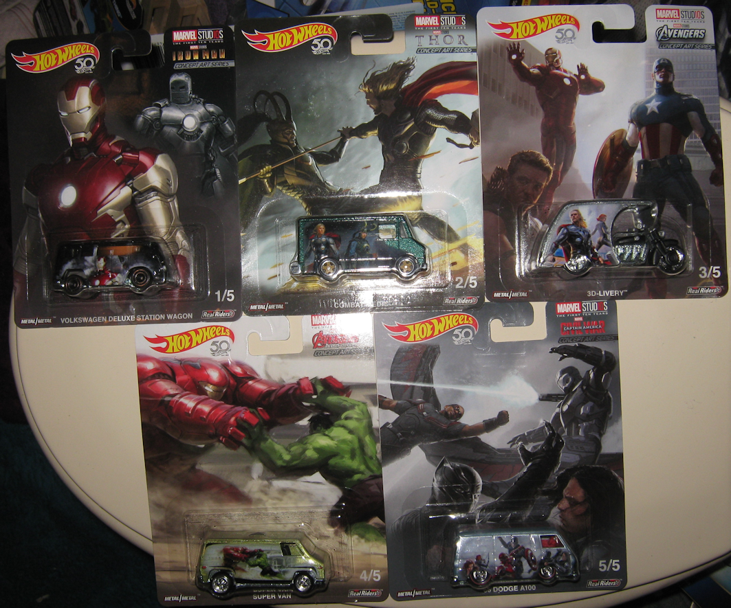
If you go back to the days of Hot Wheels’ Monster Jam, you may remember seeing the occasional revolving door of hero-themed trucks. Batman and Superman were among the most common, but there was a fairly recent Wonder Woman (somewhere around the release of the film) and a handful of Marvel characters that popped up from time to time, including Captain America, Iron Man, Hulk, Spider-Man, and an increasingly rare Wolverine. Well it seems like Hot Wheels has decided to reinvigorate the idea under their new Monster Trucks label. I spotted Hulk a few weeks back, but not long ago I found a 2-pack featuring Hulk & Spider-Man. What’s really cool is that this is a “new” design for Spider-Man and not the one seen so recently with Monster Jam.

Hot Wheels Monster Trucks - Spider-Man and Hulk

Actually, both Hulk and Spider-Man are pretty much their current respective character cars translated to “giant wheels form.” Does it feel like little more than Character Cars with big wheels…? Unfortunately, yes. I got no problems with the trucks – the quality is good and the big wheels are fun – but I’m struggling to find a real reason why Hot Wheels made such a move. If they want to do “Character Monster Trucks” I’m OK with that, but why start at such a familiar point with cars that have be released and re-released time and time again? It’d be different if we were talking something marginally obscure like Iron Fist or Winter Soldier or perhaps a new IP like X-Men or Fantastic Four, or even physically larger characters like Thanos, Sentinels, Galactus, Ego, or hell, Kingpin….but to “waste” (“introduce”?) this line of “Character Trucks” on 2 characters like this seems like misplaced effort….or desperate (shameless?) cash grab.

Hulk Monster Truck

Yeah I bought ’em, so what?

Spider-Man Monster Truck

I’m not categorically against this direction, but I do want some meaning behind it, whether it be – like I said – a sort of separate, distinct IP from the Avengers or characters that are significantly physically larger than their counterparts. This would be a terrific opportunity to give some love to the Black Order and really inject some detail and menace into them as well as a reworked Thanos. They could even hone in on something like “Spider-Man’s Rogues Gallery”…I just want something to firmly set them apart!

And maybe something will. Maybe we’re just not there yet. Maybe Mattel is testing the waters. I’m very interested to see where it all goes, I just hope where it starts is meant as a hook to sap us in to more thematically purposeful Monster Trucks! Be sure to tell me what you think of all this business below!

All done? Be sure to head on over to Part 2 to see what else is encroaching upon the “monster truck” territory! (If there’s no link yet or if the link is dead, just gimme a few hours!)

New Hot Wheels Marvel AVENGERS ASSEMBLE 5-Pack

Avengers Assemble - Thanos on the Side

Avengers Assemble 5-Pack

Not 30 seconds after spotting the Batman 5-Pack several days back, I came across the Avengers Assemble 5-Pack. This collection is somewhat unique in the fact that it has a specific theme to it – the (some) Avengers going up against Thanos and his Infinity Gauntlet. They even went a little above and beyond with the boxart to really hammer home the premise.

Each vehicle sports a basic color very prominently: red, blue, green, yellow, and orange. Now I really wish Hot Wheels could’ve made an extra slot in their normal 5-pack packaging so that we could squeeze in “representatives” for all 6 Infinity Stones…it just feels weird leaving purple out, and god knows there are enough “Avengers” to occupy the slot.

Heading the pack is Iron Man in the RD-08, a very common Hot Wheels Original in these conditions. First of all, I like how the color and the artwork work together. Against the eyeful of red is an almost silhouette of Iron Man with a nice little Iron Man logo in case you forget. However, the choice of solid color doesn’t do much for the RD-08 itself. The vehicle is a little bland with a mildly futuristic / off-road look to it. I suppose the sturdy and solid nature could be match for Iron Man and his impenetrable armor, but the RD-08 isn’t sleek or agile or all that technical. At least the choice of red = Iron Man makes sense.

Iron Man - RD-08

Second is Captain America and his Hypertruck. Blue makes sense to pair with Cap, so that’s good. The design elements on here are taken a little further; besides the blue body we’ve got red windows, red rims, and a sort of black-and-white illustration of our hero, so even though blue is the main draw, we definitely get the “red white and blue” effect. That leaves the Hypertruck itself…I dunno, I guess the fact that it’s a truck mixed with its sleek (possibly stealthy?) design says something. Again, these cars look best when played up with specific paint jobs and since that’s not exactly the goal here it’s more difficult to judge than usual.

Captain America - Hypertruck

Numero tres is The Vision in a big-ass green Vanster… Now I like the Vanster. It’s got this retro-futuristic thing going on with the transparent roof and odd little angles here and there, and for that reason I think it’s a pretty darn good match for the part-Stark, part-Jarvis, part-Mind Stone, part-Ultron “living” android that is The Vision. It ain’t a perfect comparison but I can make the connection. I’m on the fence about Vision’s illustration; on the one hand I understand the choice to define him by his shadows and leave him essentially green and white colored, on the other hand, just green doesn’t do much to make me think, “oooh Vision!” Aaaand that sort of leads into my next point: why…the hell…is…he…green!!?? Sure, a big part of his “outfit” (?) is green, but he’s also got that pinkish-magenta color going on as well as yellow. Saving up Vision for a purplish or yellow car would’ve been much smarter since few other characters feature these colors in any notable capacity.

The Vision - Vanster

Coming up next is Thor in the yellow Sooo Fast. The artwork is very nice here; it’s still just essentially 2-toned with yellow and black, but there’s a lot of detail present and the entire side of the vehicle is used. There are a few red highlights though, and they go a long way in breaking up the cartoonish yellow. Yellow wouldn’t be my immediate pick for Thor but I guess it kinda works considering the whole lightning/electricity thing. The diminutive Sooo Fast might have speed on its side but something small and round doesn’t feel very Thor-ish at all.

Thor - Sooo Fast

Bringing up the rear is Hulk in the Boom Box. Artwork gets an A for effort – the idea is that there are 3 shades going on with white being the lightest, black the darkest, and orange in between. Unfortunately, it comes off looking more a screaming, amorphous monster than the Hulk himself. Ok, you can see the Hulk but the effect is a little abstract. I guess the Boom Box is good enough for our simple-minded hero, if nothing else by virtue of the word "boom." The Boom Box ain’t no battering ram exactly but it’s not the worst choice they could’ve made either. Now let us address the elephant in the room: fucking orange. It’s bad enough he isn’t green (hell, they could’ve at least given him purple (for the pants)) but how in the world did they land on orange!? (Who would be a good candidate for orange anyway? Dr. Strange? Rocket? Groot?)

The Hulk - Boom Box

And I think that’ll about do it for the Avengers Assemble set! I like the whole Infinity Gem / rainbow effect across the cars, though I think the graphics and creativity ultimately take a small hit to keep up the gimmick. I still think a sixth “purple” slot would help get the point across, and with all the additions to the Avengers team, you’d think we’d see some folks beyond the usual staples; you know, Scarlet Witch, Falcon, Dr. Strange, I dunno, just a little deviation from the same core characters we see again and again. Overall I think this is probably one of the weaker sets of Marvel cars, but I do like the colors!

Avengers Assemble 5-Pack

Marvel Studios – The First Ten Years: Concept Art Series (Hot Wheels Real Riders)

Damn, what a mouthful, eh?

What we have here is a weird convergence of sub-series – first of all it’s a Hot Wheels Real Riders set. Secondly it’s part of newish endeavor by Marvel Studios to celebrate their first 10 years, ergo Marvel Studios: The first Ten Years. And to add one final layer of specificity, it wasn’t just “stuff” from the first 10 years of the MCU, it was concept art from the time period! The art on each vehicle is inspired by a film in the MCU and like all Real Riders, the graphics are highly detailed and of the utmost quality.

Hot Wheels Real Riders - Marvel Studios First Ten Years

  • 1 / 5 – Iron Man – Volkswagen Deluxe Station Wagon
  • 2 /5 – Thor – Combat Medic
  • 3 / 5 – Avengers – 3D-Livery
  • 4 / 5 – Avengers: Age of Ultron – Super Van
  • 5 / 5 – Captain America: Civil War – ’66 Dodge A100

This set seems fairly new. I spotted some of these in passing on eBay, and then last weekend I found most of them out at a Target in Knightdale. It was kinda weird, I found 1, 2, 4, and 5, and there was an additional 1, 2, 4, and 5 on the shelf plus a third 5. No number 3 though. I didn’t see the set anywhere else over the next week, but I decided to scoot back over to that same Target just a couple of days ago and they had plenty of number 3’s on hand. Go figure.

Before digging into the cars I want to quickly draw attention to the cards themselves. Generally speaking the Real Riders make use of amazing artwork for the backing cards and this series is no different. Like so many others, the cards hold some artistic value of their own and I kinda hate to open ’em. But we must!

The first vehicle comes to us all the way back from Iron Man where it all began in 2008. These earlier released tended to be lighter fare than the more built up pieces we’re used to now, but they did – in general – mark a significant upgrade in quality from the previous generation of superhero flicks that proliferated the early 2000’s. Although Iron Man on its own will probably be remembered as more significant than it actual was, it will rightly represent a fundamental change in the way that cinema and by extension the public approached the comic book medium. And it couldn’t be more ironic: in an era where comic book sales are at their lowest, adaptations of comic book material are ubiquitous in the mainstream. Hell, apart from Star Wars, they are the mainstream!

Marvel First Ten Years - Iron Man

The Volkswagen is decorated simply, with one side showcasing Iron Man’s modern, familiar suit, and the other featuring the clunky, clandestine, almost medieval-inspired suit that he fashioned in an Afghani cave. (Afghani, right? I know it was retconned from the original setting in like a Vietnam POW camp.)

Oh me on my, the good ol’ Combat Medic. Hot Wheels can hardly get through a Real Riders series without one…but I guess I get it. It’s shape allows for lots of graphics-friendly space. This version is covered with a dark, metal-flake teal, a color I’m not too familiar with on Hot Wheels. It does a great job of capturing the essence and otherwordliness of Thor and his mischievous brother, and thus we have this vehicle’s inspiration, Thor from 2011 and the fourth film of the MCU. I appreciate the visuals and setting of the film, but tonally I thought it was confusing and I found the characters forgettable but at least it wasn’t a flat out bad movie.

Marvel First Ten Years - Thor

The artwork centers on Thor and Loki as does the film itself. At first their interactions felt…stilted, to say the least, but I think the on-screen chemistry between the two has grown and matured over the years, and it also plays out a bit better when it isn’t taking center stage. The graphics illustrate them in all their Asgardian weirdness; they almost look like aliens.

I don’t think I’ve ever seen a 3D-Livery before. Is this new at all? Or just wildly uncommon? It’s got a bit of a Southeast Asian flare to it with the whole “bike” towing a covered “buggy” behind…although this is obviously an updated and modernized concept with a motorcycle at the front and what we can assume is pretty nice cabin/carriage to relax in. (We don’t get to see inside, so we’re just gonna have to use our imaginations.) I love the little details like the Avengers logo on the top and on the bike. I thought it was an odd choice for the first Avengers film at first, but when I saw how the artist had planned it out, it kinda made sense. You’ve got Hulk and Hawkeye on the left, Iron Man and Cap on the back, and then Thor and Black Widow on the right.

Marvel First Ten Years - Avengers

And I guess a crazy vehicle like the 3D-Livery is appropriate for such a watershed event in both film and the comic book industry. Avengers represented something that just a few short years prior would’ve been deemed inconceivable, laughable even. I was weary of watching yet another group of folks get to know each other but the payoff was decent if not a tad overhyped. (I think it’s the origin story that I’m getting bogged down with and tired of more than the actual superhero story.) I don’t wanna knock it too much though. It was a major gamble and in the end it succeeded.

Nearly 3 years later to the day we got the sequel to the big ensemble flick that already needed 5 films to happen, and that was Avengers: Age of Ultron. Overall I felt like this was an improvement, but maybe that’s just because I don’t like Hiddleston’s interpretation of Loki…I dunno, maybe I just don’t like Loki as a main character in any context. Ultron wasn’t a great villain but the film was as slick and as polished as one could ask for.

Marvel First Ten Years - Age of Ultron

Age of Ultron is commemorated rather oddly in this series, by an olive-green Super Van celebrating Iron Man’s submission of the Hulk via the impressive yet under-utilized Hulkbuster armor. “Hulkbuster” was probably the coolest thing in the whole damn movie, so I’m cool with it, it just seems strange to choose that confrontation as indicative of Age of Ultron. But again, I’m totally a-ok with it personally.

Finally we get to Captain America: Civil War, what I would consider the largest scale MCU flick up until Infinity War. In a lot of ways the inclusion of Civil War as a Captain America movie is a near misnomer. I mean it could’ve just as easily been spun as “Iron Man 4” or, how I like to thing of it, “Avengers 2.5”. They do throw a good deal of focus to Cap and..ugh…Winter…fughdhg…Solider…but Iron Man carries just as much weight if you ask me. And ultimately it is a film about the Avengers being the Avengers: who are the Avengers? What do they stand for? What is their agenda? What are their motives? I tend to like movies with villains that are just as memorable as heroes – a skill which the MCU has failed to master time and time again, possibly intentionally judging from some of what’s been said – but Civil War was a unique glimpse into what made these heroes tick and their existence as actual people first and foremost with their role as heroes being somewhat secondary.

Marvel First Ten Years - Civil War

All that being said, I wish we’d gotten a slightly more elaborate offering from Hot Wheels. One side hones in on the final confrontation between Iron Man and Cap (and Winter Soldier, who isn’t in the graphic) which is probably one of the best fights of the MCU so far. The other side features the same graphic but smaller, flanked by Black Widow and Hawkeye on the left and a clash between Winter Soldier and Black Panther on the right. Nothing wrong with it really, I just think it falls short of capturing the immense scale of Civil War, but of course anything short of depicting the scene at the airport would probably be considered “falling short;” that’s just being honest. I would like to draw attention to the aerial skirmish on the card between Falcon and War Machine, which curiously doesn’t make its way onto the vehicle…would’ve been a cool touch to stick it on the roof, right?

Hot Wheels Real Riders - Marvel Studios First Ten Years

So that’s it, right? Well yeah, sort of, I guess. One thing I’m struggling with though is where is the concept art!? All this stuff looks like it was sourced straight from the respective movie. If were talking “concept art” we ought to see lots of stuff that’s recognizable as but not identical to what we were shown in the films. And I’m not seeing it! Iron Man looks like Iron Man should look, Hulk is the right color, Cap’s shield is what we’d expect, Thor and Loki are wearing the same weird outfits…I can’t figure out why such a label was given to this set.

Am I missing something? Is it flying right over my head? Please, drop a comment and set me straight on this issue…

Hot Wheels – Avengers / Infinity War 8-Car Set (2018) Walmart Exclusive

I’m a little slow at getting to this set but I think it’s well worth covering. I’m a little curious as to how rare or in-demand this set is, because I’ve only seen these cars at a handful of Walmarts and even then after about a week their numbers were very thin and by the second week, the vaunted 8th “Chase Car” had completely disappeared.

Avengers 8-Car Set

Released in conjunction with Avengers: Infinity War, this is very thoughtful and detailed set. And the cards themselves have been carefully chosen from what must be at least 50 or more years worth of comics. Usually I just save the cards after I cut the blister off, but I was so enamored with these that I bought 2 sets – one to open and one to preserve. I also picked up some extras of the “Chase Car” (Thanos/Horseplay) in case they ended up being wildly valuable. Let’s take closer look.


Thor

1 / 7 – THOR – Bedlam

“The Avengers: A Marvel Tale of Most Compelling Excellence!”

We go way back in time with this cover to something very close to the original lineup of the Avengers. The font and the faces are a bit dated and its obvious that they’re outfits haven’t really evolved yet. One of the biggest clues is the roster: we see Giant Man (Ant-Man had officially become Giant Man at this point in time) and the Wasp. The Hulk is noticeably absent, and Captain America didn’t pop up until Issue #4, but all in all I think it’s safe to say that this is a very early incarnation of the team.

Thor

Thor in particular is celebrated here, in the form of a nice shiny pickup truck thingy. The chrome finish could easily represent Thor’s command over lightning and the sporty pickup (Bedlam) demonstrates a healthy balance between strength and speed.


Hawkeye

2 / 7 – HAWKEYE – Purple Passion

“Earth’s Mightiest Heroes! The Avengers”

Now this is an interesting cover. Somewhat dated like the previous one, it features Hawkeye in the middle of rage-quitting the team. If I was a little older perhaps I could place the language…he says stuff like, “that tears it@” and, “Hawkeye’s cuttin’ out!” I guess it’s a decent spotlight for a character who, in the MCU at least, is often relegated to second tier.

Hawkeye

Purple Passion fits Hawkeye well. Not only does it have “purple” in the name, but its sleek appearance could be seen as analogous to an arrow cutting through the air. However, I find his inclusion a bit strange, because he’s one of the 2 main MCU characters not to appear in Infinity War. I’m sure someone can tell me all about how he was in the comics and that’s cool, but c’mon, most people will be associating this collection with the new film. Now if only the car itself was primarily colored purple instead of blue…


Black Panther

3/ 7 – BLACK PANTHER – Qombee

“Earth’s Mightiest Heroes! The Avengers”

We move forward in time a little with this cover…again, I’m not an expert or comic historian, but if I had to date the cover, I’d place it in the early, maybe mid-1970s. Here’s an unusual but not unheard of lineup consisting of Thor, Captain America, Vision, and Black Panther. Apparently they’re about to go up against “Zodiac,” someone I’m 100% unfamiliar with.

Black Panther

The painted black Qombee matches >Black Panther perfectly in that regard. The thick and heavy front of the truck highlights Black Panther’s prowess in the jungle and the use of his unbreakable vibranium.


Iron Man

4 / 7 – IRON MAN – Night Shifter

Earth’s Mightiest Heroes The Avengers

I love this cover/card. It’s easily my favorite. With all the detail, meticulous shading, and expansive color palette, this is the stuff that made comics so popular in the early to mid 1990’s. Everything is so bright, the characters are practically bursting at the seams, and I really dig how color is used to create depictions of energy and light such as with Iron Man’s fists. We’ve got our classic trio of Avengers here, Cap, Thor, and Iron Man.

Iron Man

The Night Shifter is a bit of strange looking car on its own, striking a weird middle ground between stripped-down junker and souped-up future machine. Maybe it’s the metalflake gold and the red accents that make this version so appealing; whatever it is it certainly does Iron Man justice with its blend of tech and eccentricity. Overall, it’s probably my favorite vehicle of the lot.


Captain America

5 / 7 – CAPTAIN AMERICA – Pony Up

Earth’s Mightiest Heroes The Avengers

This artwork feels fairly 90’s-ish as well, but it’s more difficult for me to pinpoint, probably because I don’t know much about what comics looked like after the turn of the century. The palette is a little more restrictive and the details and shadows are a little less overblown, though it does retain that sort of “trading card look.” We’ve got yet another still of the familiar trio for this one – Cap, Thor, and Iron Man.

Captain America

Pony Up is a bit on the basic side, but maybe something as wholesome and uncomplicated as Captain America is best suited for something pure and succinct. As is to be expected, the patriotic theme is maintained throughout with its red, white, and blue color scheme.


The Hulk

6 / 7 – HULK – Jaded

Avengers Assemble

This is another great cover, maybe somewhere in the mid 2000’s based on how the faces are drawn…? I dunno, total speculation. It’s bursting with vibrant colors though and does a great job of representing the team as we know them during the early MCU: Iron Man, Thor, Hulk, Cap, Black Widow, and Hawkeye. It’s a great “family portrait” of the six.

The Hulk

As far as choosing Jaded to embody The Hulk….well, erm, I don’t know if that was necessarily the best choice that could’ve been made. Jaded is sleek and curvacious, and Hulk needs to be presented by something dense and unapologetic. The car looks great with the purple and green, I just don’t think it suits Hulk. It’s a bit too dainty and refined.


Black Widow

7 / 7 – BLACK WIDOW – Rivited

The Avengers Origins

This card is a bit different, lifting the artwork from a volume or miniseries that recalls the birth of the team. The artwork has an element of realism to it with its restrained palette and detailed shading. Curiously, the line-up shown is a tad unusual, featuring Iron Man, Thor, Falcon, and of course Black Widow.

Black Widow

Rivited is a surprisingly masculine car with which to represent Black Widow, especially in these days where lots and lots of people associate the character with Scarlett Johansson, arguably a total paragon of femininity. (Seriously, she shares this design with characters like Drax, Superman, and Winter Soldier.) I think that Jaded, the car we just talked about in conjunction with the Hulk, might’ve been a better fit with its smaller frame and abundance of curves. I gotta say though, the orange rims with the red body is a bold move.


Thanos

* / * (The Chase Car) – THANOS – Horseplay

INFINITY GAUNTLET

Oh yes,the infamous chase car that alludes us all when we’re newbies to the world of Hot Wheels – you don’t know it exists until you know it exists! Some chase cars are more vaunted than others, and I don’t know about this one yet, but it’s got that classic cover from 1991 featuring Thanos with the Infinity Gauntlet with all the Infinity Gems (they were gems back then!) mounted, and Mephisto to his left and Death looming on the Titan’s right. Easily one of the most iconic Marvel covers in modern comic history and a great choice for the elusive chase car.

Thanos

Horseplay is a decent albeit probably imperfect choice to depict Thanos. Horseplay is short and stocky, and though we may think of Thanos as inordinately tall, some of his earlier depictions in the comments make him appear a little on the short side, however, it could be a side effect of making him so damn wide. He’s definitely more of a “square-shaped” person (being?) than the typical “rectangle” of “normal” folk. The car is a little on the plain side but I do like the combination of black, purple, and gold. It would’ve been nice if they could’ve worked in the Infinity Gauntlet (or Stones) themselves, even if it was just a graphic. Regardless, it’s worth getting this just for the card!


Well that took a lot longer than I’d anticipated! Tell me what you think of these cars and remember to keep an eye out for Thanos / Horseplay because it will not be numbered like the rest!